Is indigo blue—or is it purple? If you’ve ever hesitated before answering that, you’re not alone. Indigo is one of the most misunderstood colors, sitting in that strange in-between zone that trips up designers, students, and curious minds alike.
This guide clears that confusion completely. You’ll understand exactly what indigo color is, why people disagree about it, and how to use it confidently in real life—from digital design to fashion.
- Clear definition of indigo color (no ambiguity)
- Whether indigo is blue or purple—explained properly
- HEX, RGB, and practical usage
- How indigo compares to navy, violet, and royal blue
- Its history as “blue gold”
- How indigo is made (simple explanation)
- Real-world uses in design, fashion, and branding
- Common myths and misconceptions
What Is Indigo Color?
Indigo color is a deep, rich hue that sits between blue and violet on the color spectrum. It combines the calm stability of blue with the depth and intensity of purple.
In simple terms: indigo is a dark blue with a noticeable purple undertone. The word itself traces back to the Latin indicum, meaning “Indian”—a nod to India’s centuries-long role as the primary source of natural indigo dye exported to Europe.
The Exact Shade of Indigo
Indigo isn’t a single fixed shade. It shifts depending on lighting and context:
- In bright light → appears more blue
- In low light → appears more purple
- Under warm indoor lighting → can look slightly muted or violet-leaning
- On digital screens → often reads as deep blue
This context-sensitivity is exactly why indigo feels “hard to pin down.” It’s not a static color—it behaves differently depending on where you see it.
Indigo Color Code (HEX, RGB, CMYK)
| Format | Value |
| HEX | #4B0082 |
| RGB | 75, 0, 130 |
| CMYK | 42%, 100%, 0%, 49% |
| HSL | 274.6°, 100%, 25.5% |
For web and UI work, start with the HEX or RGB values. Switch to CMYK when preparing files for print. The HSL value is particularly useful when working in CSS or design tools that use hue-based colour models.
Is Indigo Blue or Purple?
The short answer: indigo is both—but it leans closer to blue.
The confusion exists because indigo sits right at the boundary where blue transitions into violet. Our eyes don’t easily separate that boundary, which is why perception varies from person to person—and even from screen to screen.
Why Indigo Is Hard to Distinguish
Human vision struggles with certain wavelengths of light. Indigo falls into a range that overlaps what we perceive as blue and violet. Two people can look at the same swatch and genuinely disagree—and both can be technically correct.
Interestingly, even Isaac Asimov noted that indigo appeared to him as simply “deep blue,” questioning whether it deserved to be treated as a distinct spectral colour at all.
The Indigo Debate Explained
Historically, indigo was included as one of seven distinct colours in the rainbow by Sir Isaac Newton (the familiar ROY G BIV). But Newton’s original intent placed it in a narrow band between blue and violet—a region most people still struggle to isolate with the naked eye.
In modern science and design, many argue indigo isn’t clearly distinguishable enough to stand alone. There’s also an interesting quirk from the web’s early days: when programmers built the X11 colour list that became the foundation for HTML and CSS colour names, they assigned the name “indigo” to a far more purple-leaning hue (#4B0082), accidentally shifting how an entire generation of designers perceives the colour.
In practice, indigo is best understood as a transitional colour—bridging blue and purple, rather than sitting firmly in either camp.
Indigo vs Other Colors
To truly understand indigo, it helps to see it side by side with the shades it’s most commonly confused with.
Indigo vs Navy Blue
- Indigo: has a clear purple undertone
- Navy: pure dark blue with no purple influence
Indigo vs Violet
- Indigo: darker and more blue-dominant
- Violet: lighter, with more red and purple in its base
Indigo vs Royal Blue
- Indigo: deeper and noticeably more muted
- Royal Blue: brighter, more vivid, and clearly blue
A quick working rule: if you see a hint of purple in a dark blue, you’re likely looking at indigo. If the blue feels clean and undiluted, it’s probably navy or royal blue.
The History of Indigo: From “Blue Gold” to Denim
Indigo has one of the richest histories of any colour. For centuries, it was among the most valuable commodities on earth—rarer and more expensive than most spices.
The dye was extracted from the leaves of the Indigofera plant, a process that was labour-intensive and time-consuming. Because of this, it carried enormous value and earned the nickname “blue gold.”
Why Indigo Was So Valuable
- Rich, long-lasting colour that resisted fading
- A complex extraction process that few could master
- High global demand across Europe, Asia, and Africa
Ancient Egyptians used indigo for clothing and even on the walls of pharaohs’ tombs. In ancient China, it was reserved for silk fabrics. Guatemala was considered one of the world’s foremost suppliers by the late 18th century, and the dye shaped trade economies across continents.
The Shift to Modern Indigo
In the late 19th century, synthetic indigo was developed, dramatically reducing the cost and complexity of production. This shift made the colour accessible at scale—and gave rise to one of its most enduring legacies: denim. That’s why your jeans still carry a piece of indigo’s story.
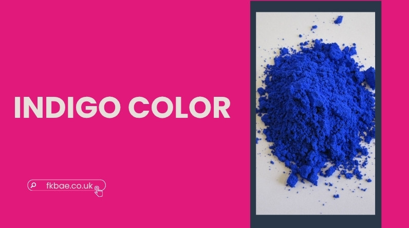
How Indigo Is Made (Simple Science)
Indigo dye comes from a chemical transformation process. The key compound at the heart of natural indigo is indigotin, the molecule responsible for its characteristic colour.
Natural Process (Simplified)
- Leaves from the Indigofera plant are soaked and fermented in water
- Fermentation breaks down the plant compounds
- Exposure to oxygen triggers a chemical reaction that turns the liquid blue
- The dye is extracted, dried, and formed into cakes or powder
Why Indigo Changes Color
Indigo isn’t blue at the start of this process—it actually begins as a colourless compound called indican. It only turns blue after oxidising in open air. This is why freshly dyed fabric often has a greenish tinge before the characteristic deep blue develops fully.
Indigo Color Meaning and Symbolism
Indigo’s symbolism isn’t arbitrary—it grows directly from how the colour behaves visually and how it’s been used throughout history. It occupies a space between two powerful colours, and that duality shapes its meaning.
Psychological Associations
- Calm and focus (drawn from its blue foundation)
- Depth, mystery, and introspection (drawn from purple)
- Quiet authority and understated confidence
- Wisdom and intuition—indigo is associated in some traditions with the “third eye,” representing perception and higher understanding
Cultural Interpretations
- India: heritage, craftsmanship, and centuries of textile tradition
- Japan: purity and refinement in traditional fabric dyeing
- Western cultures: professionalism with a creative edge
Its meaning isn’t fixed—it adapts based on context. In one setting indigo reads as grounded and corporate; in another, it feels mysterious and artistic.
How Indigo Is Used Today
Indigo in Fashion
Indigo is most recognisable in denim, but it shows up across the full spectrum of fashion:
- Formal wear, as a softer, more interesting alternative to black
- Streetwear, where its depth creates natural contrast
- Accessories, for a subtle colour accent that reads as refined rather than loud
Indigo in Interior Design
Indigo works well in interiors precisely because it’s bold without being aggressive. It anchors a room without dominating it.
- Creates a calm, moody atmosphere well-suited to bedrooms and reading spaces
- Pairs naturally with neutrals, warm whites, and metallics
- Adds depth to a scheme without the harshness that some deep colours introduce
Indigo in Branding and UI Design
In digital design, indigo occupies a useful middle ground—more distinctive than navy, more restrained than pure purple. Brands like Mindvalley and Reflect have used it to signal creativity paired with credibility.
- Replaces black for a softer, more approachable feel
- Signals trust without the overuse that comes with standard corporate blue
- Delivers strong contrast for readability in text and interactive elements
A practical approach: use indigo as a dominant colour for backgrounds or branding, or as a high-impact accent for key elements like buttons and links. Its relative rarity in mainstream branding also works in its favour—it stands out in a crowded visual landscape.
How to Use Indigo Effectively
Best Color Combinations
- Indigo + white → clean and modern
- Indigo + gold → rich and luxurious
- Indigo + pink or orange → bold, high-energy contrast
- Indigo + gray → subtle and well-balanced
- Indigo + mustard yellow → dynamic and contemporary
When to Choose Indigo
Reach for indigo when you want:
- More character and depth than navy can offer
- Less intensity than outright purple
- A colour that feels both grounded and imaginative
It tends to work best when black feels too severe and standard blue feels too plain. Think premium, thoughtful, and slightly unexpected.
Common Misconceptions About Indigo
- “Indigo is just dark blue”
It has a distinct purple undertone that separates it from plain dark blues like navy. - “Indigo isn’t a real colour”
It exists as a measurable wavelength on the visible spectrum—but human perception of exactly where it begins and ends does vary. - “All indigo looks the same”
It shifts significantly depending on lighting, surface material, and surrounding colours. - “The web colour ‘indigo’ is the same as spectral indigo”
They’re actually different. The CSS colour named “indigo” (#4B0082) is more purple-leaning than the spectral indigo Newton described—a quirk of early web programming history.
FAQs About Indigo Color
What is the closest color to indigo?
Navy blue is the closest in terms of darkness, but it lacks the purple undertone that defines indigo. Prussian blue and ultramarine are also in the same family.
Why is indigo hard to see?
It falls in a narrow wavelength range where human vision struggles to cleanly separate blue from violet, making it genuinely harder to isolate than most other spectrum colours.
Is indigo really part of the rainbow?
Traditionally yes—Newton included it in his seven-colour model. Modern science, however, questions whether most people can distinguish it clearly enough from blue and violet to count it as a truly separate band.
What colors go well with indigo?
White, gold, gray, pink, orange, and mustard yellow all work well, depending on whether you want contrast, warmth, or a more restrained, balanced result.
Is indigo used in modern design?
Yes—and increasingly so. It appears in branding, UI design, interior decoration, and fashion, often chosen specifically because it offers something more distinctive than the standard blues that dominate most professional contexts.
Conclusion
Indigo sits at a genuinely fascinating intersection—between blue and purple, between science and perception, between ancient trade history and contemporary design. That layered quality is precisely what makes it such a compelling colour to work with.
Once you understand its dual nature, indigo becomes much easier to recognise and use with confidence. Whether you’re selecting a palette for a project, thinking about a room’s colour scheme, or simply trying to settle a long-standing debate about the rainbow, the key insight is simple:
Indigo isn’t meant to fit neatly into one category—it’s always existed in the space between them.